
7 Sticky Navbars Your Site Is Begging For

One trend that's been gaining momentum in recent months is the sticky navigation bar. A sticky navbar follows the user as they scroll down your page, making it easy to move to any area of your site without the need to scroll back to the top.
You have just a few seconds to make a good first impression on site visitors. If your navigation bar is easy to find and intuitive, people are more likely to form a positive image of your brand. One user experience (UX) study showed fixed navbars reduce browsing by 22 percent.
Sticky navbars aren't new to design, but have gained popularity due to the number of people scrolling rapidly down website pages. Figuring out the best ways of implementing sticky navbars isn't easy. You don't want the bar to cover important information or create issues for mobile users. Here are seven types of sticky navbars your site may benefit from.
1. Top Sticky Nav

One option is placing your navigation bar at the very tip-top of your design. As the user scrolls down the page, the bar follows along, but unobtrusively as it is at the top of the screen. Powderlife features a sticky navigation bar at the top of its website. As the user goes through the different options on the page, the navigation choices remain in the visual line of the user.
One of the complaints some have with sticky navigation bars is the distraction factor. Placing the bar at the very top eliminates this issue.
2. Separated by Horizontal Line

Another way of setting your navigation bar apart as it follows the user down the screen is giving it a boxed area. Adding a horizontal line or some other way of setting the nav bar apart avoids confusing the reader about what's occurring as they use the features on the landing page.
Letter Friend features a sticky navigation bar that moves along with the user, but the nav bar is set off with a white background and a yellow horizontal line across the bottom. Adding the line allows the user to compartmentalize the navigation bar and ignore it until it's needed.
3. Highlighted Logo Navigation

There are some website elements consumers expect. For example, people look for the logo of a website for quick navigation to the home page. One smart use of the sticky navbar is including your logo in the bar and linking it to your homepage.
Finishing Systems features a sticky navbar near the top of its page. The logo appears to the left side of the navbar and is clickable. This provides fast movement between any page the user is on and a path back to home.
4. Motion Graphics Sticky Nav


As the user moves down your page, their needs may change. Your sticky navbar can also change as the person scrolls. Take a look at the way Search Engine Journal utilizes a motion graphics-style sticky navbar to best meet user needs.
When you first land on SEJ's homepage, you see a navigation bar without a logo. The name of the site is directly below the navbar, so there is no need for one. However, as you scroll past the name of the site, the logo appears in the upper left corner of the navbar.
5. Side Sticky Nav
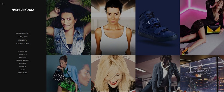
What if your site doesn't require scrolling down? You can still utilize a sticky navigation bar in interesting ways, such as placing to one side and making it collapsible.
AWD Agency utilizes this technique, filling the screen with images of its work. Collapsing the navigation, which appears to the left side, makes the images larger. If you need to navigate elsewhere, you can bring back the collapsed nav bar with a click of the arrow.
6. Animated Sticky Nav

Adding an element of animation to your sticky navbar grabs attention and lets users know the bar followed them down the page and is there if they need to take action. Take a look at the brilliant way the Graz Secrets app utilizes animation to bring attention to the action it wants users to take.
There is a rotating circle in the middle of the sticky navbar that reads "Download Now." Think about the goal of your landing page and the call to action. Include that CTA as an animated element in your navbar.
7. Transparent Background Nav

If you want your sticky navigation to look like a seamless part of the page no matter where the user is, then add a transparent background. The navbar will automatically match whatever element of the page it sits over.
Grain & Mortar does a good job with its transparent sticky navbar. Watch how the navbar changes as you scroll down the screen. Starting off, the navbar shows the hero image in the background. As you move down the page, the background looks white like the background of the content.
Drive Conversions and Focus
A navigation bar accomplishes a lot of work in a small space. It provides direction throughout your website, drives users to action with CTAs and keeps the focus on where users need to move throughout the buyer journey. If you haven't tried a sticky navbar, introduce one or more of the elements listed above and see how much more engaged your users become.